Showing posts with label Rouda. Show all posts

Monday, April 27, 2009

p.2 - Group activity


Here we paired up people, categorized them according to what they would eat, use, wear, and drive.

Sunday, April 19, 2009

Paper lecture documentation

Paper-

steps in printing:

1-pre-press
2-printing
3-post press

pre-press

-film--->plate--->CMYK
Printing

post press

-Stitch glue vam.
-Fold
-vv crease
-Coated
-Art paper
-90 GSM 300
-Flyers/brother/magazines

Alsharq uses:
CPT

Standard paper size in Qatar:
70 cm x 100 cm =9 A4,4 A3

paper type:

Uncoated
Wood-free
Bristle
NCR
Duplex

cutting machines:
70 cm x 100 cm
64 cm x92 cm
62 x 88 cm
45 cm x 64 cm

There's two ways to know the weight of the paper:

1-experience 
2-Measure 

The thicker the paper the better
White paper are the most expensive
The more off white it is the cheaper


in class notes

In class notes-
Catalogue-

1- Grid
Present your master page

A B C

The same grid but different placement with the same grid.we can create different different vi-rations.

2-Style sheet
typeface
size
weight 
function

3-text/content
type your text in Microsoft word or text edit

4-story board
outline
thumbnail map

Friday, April 10, 2009

In class notes

In Design-

when we do publication we have to have the content.

Paper size
3 cm bleeding at least (from the inside)

Vision of what we need-
content to conclude 
concept
calculate how many pages
leaving a mark

Publication
We need to know:

1-content
2-purpose
3-concept-try to generate it
4-pages-chapters
5-Typography study type
look at our catalogue


Monday, April 6, 2009

in class notes

Print based medium 
_________________
1. System
2.Working with limitations
3.Rules and braking the rules
4.Time management
5.Information design
6.Layout composition
7.Concept--> design

How to look at systems identify it

Put it back to in design and fix it.
-color CMYK
-images 300 dpi
-Paper size

Wed the 8th april-in design lecture
Mon the 13th-Paper lecture
Wed the 15th-Binding
Mon the 2oth-printing field trip :)

Do a report-what we learned from the trip-document everything.. take photos ..write notes..

Wed the 22th-Publishing and printing


Type workshop


Monday, March 30, 2009

In class Notes

Type

1-Herachy 
2-contrast
3-Micro-Macro
4-legibility 
5-visual engaging 
6-colors
7-communicate 
8-illusion/perspective
9-Type as image 
10-layout/grid
11- Structure (system)
12- composition -the whole harmony 
13-concept


Depth

A piece of paper has two planes -Vertical and Horizontal

Workshop  -

limitations -
-black and white
-shapes (only)-line,dot,square and rectangular.
                            
                                Factors x 4
1 [Think of-->composition   
                    illusion
                    hierachy ]

pat attention to the Positive and Negative space-

2[ colors
    contrast
   Micro/Macro]
Grey scale 
scale color + -
relationship 

3[balance           x2
-symmetrical 
-Asymmetrical 

Direction
-horizontal
-Vertical
left to right 
top to bottom

5 [Pattern repetition   x4
                    rhythm 

a Square=Block of text 

H.W-
Complete what we did in class
use one typeface for now with different weight (bold/Italic/....etc) 


Wednesday, March 18, 2009

class notes+one o one critique


Critique:
In the circles specify more like use the brand logo (galaxy,bmw ...etc)instead of repeating the same idea.
lose the grey box in the other pages,and use something else like images.
________________________________________________________________________


Class notes-

Must- 1- specify 
2-how many copies we are printing?
3-work with limitation 
4-not use images from the net couse its not high quality
5-sort the content--> and then do the catalogue

publication--->has to be suitable to our concept.


Tuesday, March 17, 2009

Sketches and class notes


what is a system?

rhythm
shuffle-template around
how to split the grid 
image that gives diversity 

1-Title
2-Teaser
3-Quote
4-series of photographs
5-folio number +line
6-Individual Image
7-captain
8-category-blue box + white type
9-call out
10-Graphic elements
11-illustrations
12-color
13-chapter divider

Text type must be the same for titles


Wednesday, March 11, 2009

In-class NOTES


1)Can you identify each lifestyle by their image of artifact?

2)What are relationships of that artifacts how do they relate?

3)system
--------------- 

hierachy 
grid
image
treatment
color
Typography
layout 
rhythm
pacing

Limitation
each lifestyle needs to contain at least 10 artifacts 

5 requirements

cloth
food
phone
car
furniture


Process

Experimenting with the layout-

Hand sketches-figuring out the form of the catalogue.

_______________________________________________________

Its hard for me to break out the text ,move it around and place it in different style in the computer.So over the weekend I tried to stay away from the computer and start figu
ring out my system and grid using lose text
 and images from magazines. 
What I basically did, I printed out a grid and I started cutting different sizes of text,different typeface and images and I started placing them on the grid,moving them around the page and so on..
I realized that Its much easier this way...Its easier to control the images and text this way then using the computer ... 
This technique also taught me how to work with
 hierachy and the treatment of the grid..After doing this sketch I believe that I am able now to do the same using the computer...


Monday, March 9, 2009

Layouts


System

Monday class with levi-

System- is a set of rules.that we need to follow in a way.Rules overlap and break each others.A goo
d system is kind of a balance between control and freedom.We can have different systems but we should have elements that link those systems together.

Catalogue-its a collection by
 different things that brought together.It basically to s
ell something ,it could be to sell a
n idea or a product.

First-Set a 
rule-
for example-

Quotes--->always start from the top
.

Content---> starts from the middle.

Second design a grid-

we can design
 more than o
ne grid like one for the type and
 another for the image.It depe
nds on how we relate those different g
rids to out s
ystem or concept.

Type--->Caps
    --->lower
-case

we can play with one typeface and experiment with it.

Section- 

each section 
could be treated differently by
-grid
-type
-style

but it shoul
d be somehow 
related.

Color-
one color pallet (two or three)

Typeface- one type face
we can make it bold Italic or reg
ular.To show different ideas.Its
 more consistent to use one typeface but its up to us in the end.

Things that define our system-

-Road Marks:Li
ke a mark images-something th
at tells us that we are still in the 
same book.
-Land Marks:
-Section Markers:a mark that define each
 section like a symbol.

How to create a system from our ideas-

Concept--->spread it our to different p
arts.
Ways to apply different part of the concept to different aspects.
Size-
-Thick books--> for example give us the impression that the book is serious.

-practical.

Structure of the content- 

How things are organized.
Is there sections or not..etc
the layout structure.

Type of contents-

*Typography
*Essay
*what kind of text--->Quotation
                  --->paragraphs
                  --->interviews 

How the content deliver.

-essays
-interviews
-arguments
-Quotes

It could be deliver in many forms.

Different attributes-

1-size/format-->poster
             -->book
             -->post cards
2-audience

3-color

4-format of images-

-the content of the images
for example all of the images have people this is a one content.
images which has buildings is another content.

-Style of the photographs
The feel of the photographs.

-Layout
could depend on images or typography.
the layout of the images for example.

5-Typography

Content of the type.

Numbers
essays 
quotes

The feel of the type.


Friday, March 6, 2009

Research

I did a little research about university students life style-

Scientist lifestyle-

Scientists  were in the habit of working for nearly 12 to 18 hours a day. There were about Seventy such scientists working on a project. All the scientists were really frustrated due to the pressure of work and the demands of their boss but everyone was loyal to him and did not think of quitting the job.

http://vinothkumarm.blogspot.com/2008/11/scientist-lifestyle-scientist-in-family.html

From a forum

medical scientist lifestyle

SDN Members don't see this ad.
a big factor in my final career decision is lifestyle. i know exactly where i want to live and it is not in california, maryland, washington, or north carolina. is it possible to be a medical scientist in a smaller midwestern town and have your own lab? is it possible to move in with a hospital and do research there? are your hours as a medical scientist more conducive to a family life than as a clinical physician?


For hours as a medical scientist, this again is up to you. It is a common misconception that MD/PhD restricts you from having a family. However, like all things, this will require balance and sacrifice. Still, I would argue that a medical scientist would have the same amount of time as a clinician for family in their career depending on the choices that they make (same goes for the clinician of course).


http://forums.studentdoctor.net/showthread.php?s=&threadid=81622

Artist lifestyle-

Art -- art is a source of great pleasure in life. Personally, I'm actively involved in creating art (mostly music and poetry) as a value to be experienced in the world. Even for those who are not active as producers of art, I think the highest experience and greatest enjoyment of art come from discussing it with others, thinking about it, reflecting on it, selectively attending to what one likes and does not like, seeking out art one might enjoy, etc. Here again, the value of art can be measured along the dimensions of conceptual understanding, self-direction, achievement, and enjoyment.


http://www.saint-andre.com/thoughts/meaning.html


by Marjorie Smith

Potter Carl Sheehan, '77 Art, is one of many MSU students who came to Bozeman and fell in love with the area. He has managed to stay and make his living as an artist--with a little flexibility. Sheehan is spending his 24th summer "on display" as resident artist at the Old Faithful Lodge in Yellowstone National Park. And yes, he says, "My work has definitely been influenced by the location where I do it."
Sheehan says he has been intrigued by the western landscape since he first came to Montana in 1975, following the woman who eventually became his wife, Becky (who graduated in 2000 in graphic design). When he told his ceramics teacher at the junior college he attended in Michigan that he was heading for Bozeman, he first heard about MSU's famous ceramics professor, Frances Senska.
"She'd already retired by the time I got here," Sheehan says, "but even so, she's been a great mentor to me." Senska gave him some life-defining advice when she told him that choosing to be a studio artist would not make him rich, but "it will afford you a certain lifestyle." Although he did teach junior high art for a couple of years and still teaches occasional classes at Bozeman's Beall Park Art Center, for the most part he earns his living as a studio artist.
Each summer Sheehan heads for Yellowstone Park with a truck and trailer loaded with supplies and equipment. "When I was first invited to spend a summer in the park, I designed and built a kiln there. They give me room and board and sell everything I can make."
Sheehan thrives on working in front of potential customers and says, no, he doesn't really feel like another park wildlife exhibit. "I like the banter," he says. "I especially like watching the kids--their eyes just light up when they see a lump of clay transformed to a pot under my hands." He delights in handing out bits of clay to the kids, earning frowns from parents worried about keeping the interior of the car clean.
In his years at Old Faithful, Sheehan has met and chatted with some famous people including Presidents Bill Clinton and Jimmy Carter and radio host/humorist Garrison Keillor. But his favorite celebrities are still the geysers. "I never get tired of watching them. In the evening I ride my bike on some of the paths and watch for the less well known geysers to erupt."
Sheehan credits one other member of the MSU faculty for his successful career. "Rick Pope has been a great mentor and buddy since I graduated," he says. "He's more than a former professor--he's a friend."

http://alumni.montana.edu/news/collegian/archive/august/sheehan.htm

Comprehensive sketches


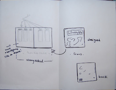
1-University students life style-

scientist 
art
business 
          stationary
           books
           notebook
           laptop background
           pencil case
           car
                                                                                       mobile
                                                                                      clothes
                                                                                      bags
                                                                                      Mugs
                                                                                      Key Chain

Tuesday, March 3, 2009

Catalogue response


Image 1-
System-

1--This catalogue has a very organized system.The designer here organized all the images on the left side 
leaving the right side for the text and page numbers.The designer here used a grid to organized the catalogue and in my opinion I think that grid help a lot to organize information text and images.It helps to sort out a clear and successful layout.

2-Color-

this catalogue contains only two set of colors which are dark pink and greyscale. Those two colors work well with each others ,pink and red works well with black and white.Point in fact, its becoming clic
he. Designers mostly turn to black and red and their scales when they have difficulties in choosing the color and that might be the weakest point in this catalogue.I think that this catalogue would have turned much better if the designer tried different colors.It would have been more interesting and motivating.I like everything about this catalogue the organization the choice of images and the layout itself (but am not sure about the choice of color).If it was me I would have tried different colors.I believe that its really important to experiment with color and try new colors I did tried before.It help us learn and at the same time it help us to break apart from our fav. colors.

3-Text and images-

The designer here chooses very bold type face which i believe works with the choice of ima
ges.The images are very scientific very bold,it tells us about something that has to do with technology and science.Therefor, I think that the type face works just fine with the images.I think that the way the designer cropped the images is really interesting.The images are very alive its playful and creative.I also like the way the designer added colors to the images,its not just black and white it has shades of pink as well which is nice.

4-Transition-the designer linked the pages using organic forms and lines that link the follios together.I believe that transition is the most important part because without the audience would get c
onfused or lost.It tell us how the pages are related to each other and it keeps us on track.

5-Chapter and follio-the designer showed the chapters by number and I guess that every follio here represent a chapter like 01 chapter one and so on...The follios however are spread two half (like a small book)

analyze -

I believe that this catalogue has a system that hold all the elements I mentioned together.However the main purpose for this catalogue is for people to see and learn.It has a message for the audience.
Thid catalogue also has a front page and a back page which is also important in any catalogue its like a short definition to the catalogue itself.


Image 2-
System-

1-Unlike the first catalogue,this catalogue is very pragmatic.It has a lot of information and text.This catalogue is for a board game and there for the first priority here was the text and informaion and then the images.

Tile-It has a centered title and a subtitle bellow it.
This catalogue is organized but somehow its very dead and boring.I think that this catalogue has a lot of text that when we read through it we get dizzy and confused.I believe the solution to that is to break the text into different parts with a title for each part like for example.

Instructions-
(bold point text)
how to play the game-
(bold point text)
and so on....

Couse its really confusing and boring this way.

2-color-

the only color the designer used here was black and colored images.The audience of this catalogue are people who are interested to play this game and mostly they'll be teenagers and people who like fun.Therefor, the designer should have used more color otherwise the audience would get bored and wold even not read the catalogue itself.

3-Images-

I like how the designer cropped the images like the images of the baseball and how he/she joined the images to the text.I think that is really interesting and appealing.I also find the idea of using images of the board-game itself is claver because it keeps us on track and it tells us what's the game is really about.

4-I also find the idea of adding bars or key frames to the catalogue is working but its not aligned at all.In one page the keyframe is stretched to the end of the page and in the other place its cropped.I think the designer here should use one format and scale for the keyframe and place it to the different pages in the same placement.

I also find the ragging in the paragraphs interesting...its playful and at the same time appealing to the eyes. 


Image 3
System-

This catalogue has a chaotic layout(playful and energetic) it has a little to do with organization somehow.

This is a spread from a health catalogue that I find really interesting.It has great graphic elements and choice of text.

1-Tile and text-

The title of this spread or page is focus and the designer represent the title in a very motivating way.inbetween each letter he place a dot     F.O.C.U.S and that to catch the audience attention.However the use of capital letters works as well,it makes a statement and it helps the audience to recognize the title between the other text.The faded text on the blue background is also working with the concept .Because it gives us the feeling of relaxing,working out.. etc
The designer here used two different typefaces one for the title and another for the text itself and i think that two typefaces are enough for one catalogue.We don't need more than that to represent our ideas.We can also represent different ideas by using the bold ,italaic,regular and by scaling and so on .

2-color-

the color green represent life,health and movement so i find it really working with the concept.The color blue on the other hand might represent fresh air and life as well.I also like how the designer here mixed those two colors with white and grey it created an interesting combination of color.

3-As we can see the first priority in this catalogue is image,The catalogue focused in the images more than the text.Also the way the designer cropped the images and placed them in the spread is playful and motivating.It shows us movement LIFE.It tells us something about sport....

Transition and layout-

The designer here split the spread into three columns and he joined those columns by using images and text and that really important.Columns or spreads should be joined somehow otherwise it would look unrelated and pointless.The images in this catalogue is realistic and I believe that its a god choice for the concept itself.The images shows healthy sporty people.It like an encouragement for the audience-like do what we tell you and you will look like the girl in this images.It works-I Can get the msg by looking at the images..The images is very appealing and clear.

The idea od overlapping doesn't work all the time but here I find it working.The way the designer over lapped text and images is creative and nice.It is playful and energetic at the same times. -Energetic represent SPORT. 

The lifestyle here is sporty people-and the images and text relate to the lifestyle.

In this response I talked about different style,shape and idea of catalogues.I studied those catalogue deeply and analyzed them as well.I believe that the response I did covers everything about the following catalogues.I tried to talk about the elements we discuss in class and system itself.As you can see every catalogue of those three has a complete different system and layouts and that depends ON THE CONCEPT.We have to figure out our concept first and then think about the layout.As soon as we figure out what our system is really about everything else would follow along easily.I also learned from this catalogue how to organize images and text,Hyrachy and transitions.